This is the third of a
series of blogs that explores the 2015 English Indices of Deprivation. This post focuses on the rural-urban divide in the Index of Multiple Deprivation (IMD) and on the performance of England’s eight Core Cities, the largest cities outside London.
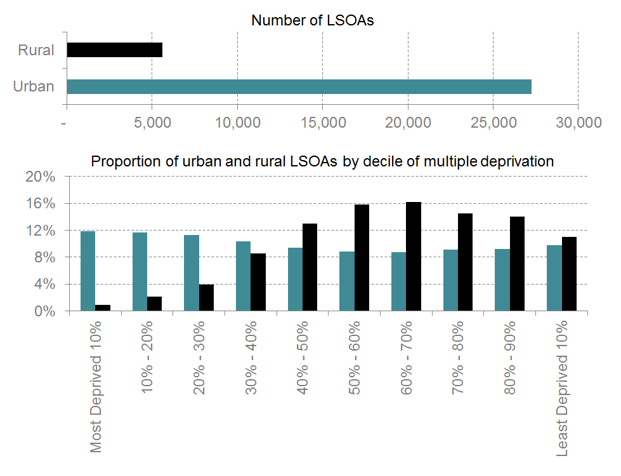
First, most people in England live in urban areas and the areas we analyse (Lower Super Output Areas, LSOAs) are designed to be as consistent as possible in terms of number of people that live within their boundaries. Consequently,
most of the areas we focus on are urban (which does not imply that England is mostly
urban and built-up –
it is not).
Second, urban areas tend to rank as more deprived than rural ones. It is possible to calculate this by ordering LSOAs by most to least deprived and dividing them into ten equal groups (deciles). Over a third of urban LSOAs are among England’s 30% most deprived, while only 7% of rural LSOAs are. This is clearly visible in Figure 1 below.
Figure 1: Number of Lower Super Output Areas by rural/urban classification and proportion decile of multiple deprivation (Source: DCLG, NLP analysis)
The fact that rural areas rank as less deprived does not mean that they are also wealthier. The Index is designed using indicators that only measure individuals’ deprivation, not their affluence. Therefore it does not rank places from poorest to richest, but rather from highest concentration of deprived people to lowest.
Interestingly, the distribution of LSOAs across the deciles of deprivation is broadly consistent in urban areas but it is visibly skewed in rural areas. This clearly shows that relatively wealthier city councils must bear a heavier burden in overcoming deprivation than their rural counterparts.
Core Cities
Identified by the Coalition Government in 2011, Birmingham, Bristol, Leeds, Liverpool, Manchester, Newcastle upon Tyne, Nottingham and Sheffield are England’s Core Cities. In case you were wondering how deprivation in these cities has changed between 2010 and 2015, we have used the same methodology that we had already used
in this post, and then charted it and mapped it.
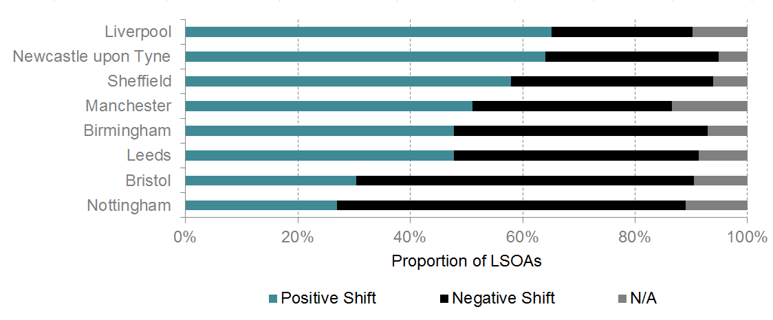
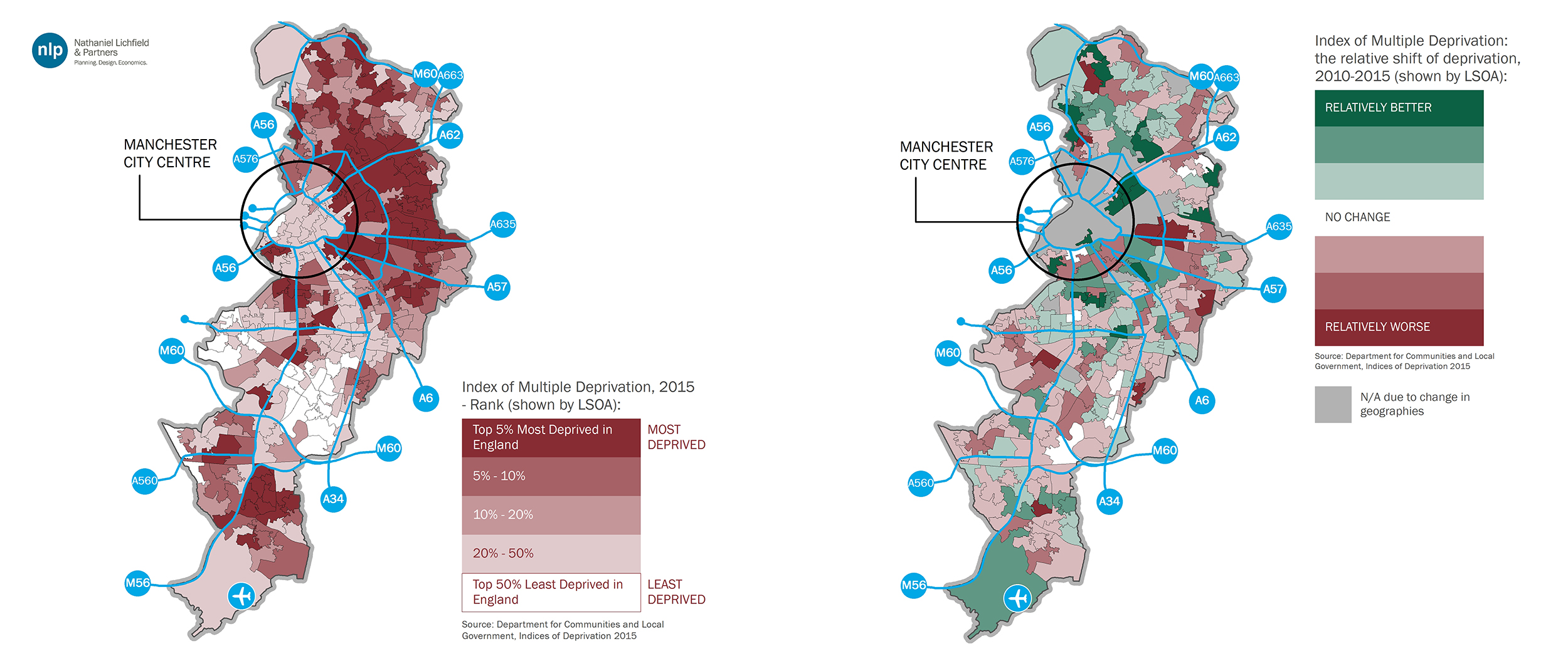
Manchester, Liverpool, Nottingham and Birmingham are
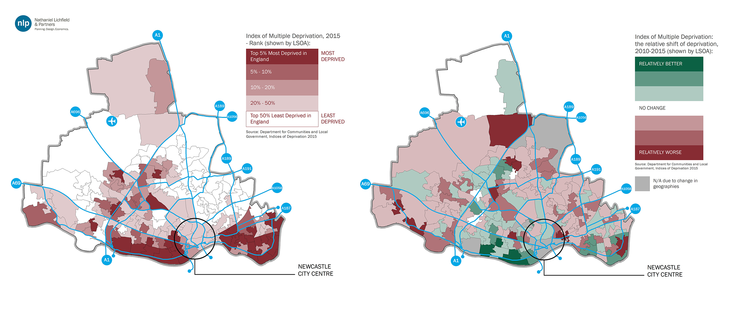
amongst the 20 most deprived local authorities in England, but their relative performance since 2010 has varied considerably. As shown in Figure 2, Liverpool and Newcastle upon Tyne have seen over 60% of their LSOAs experience a positive shift in the Index. Conversely, the shift in Nottingham and Bristol has been mostly negative.
Figure 2: Direction of shift in LSOAs’ deprivation score in Core Cities (Source: DCLG, NLP analysis)
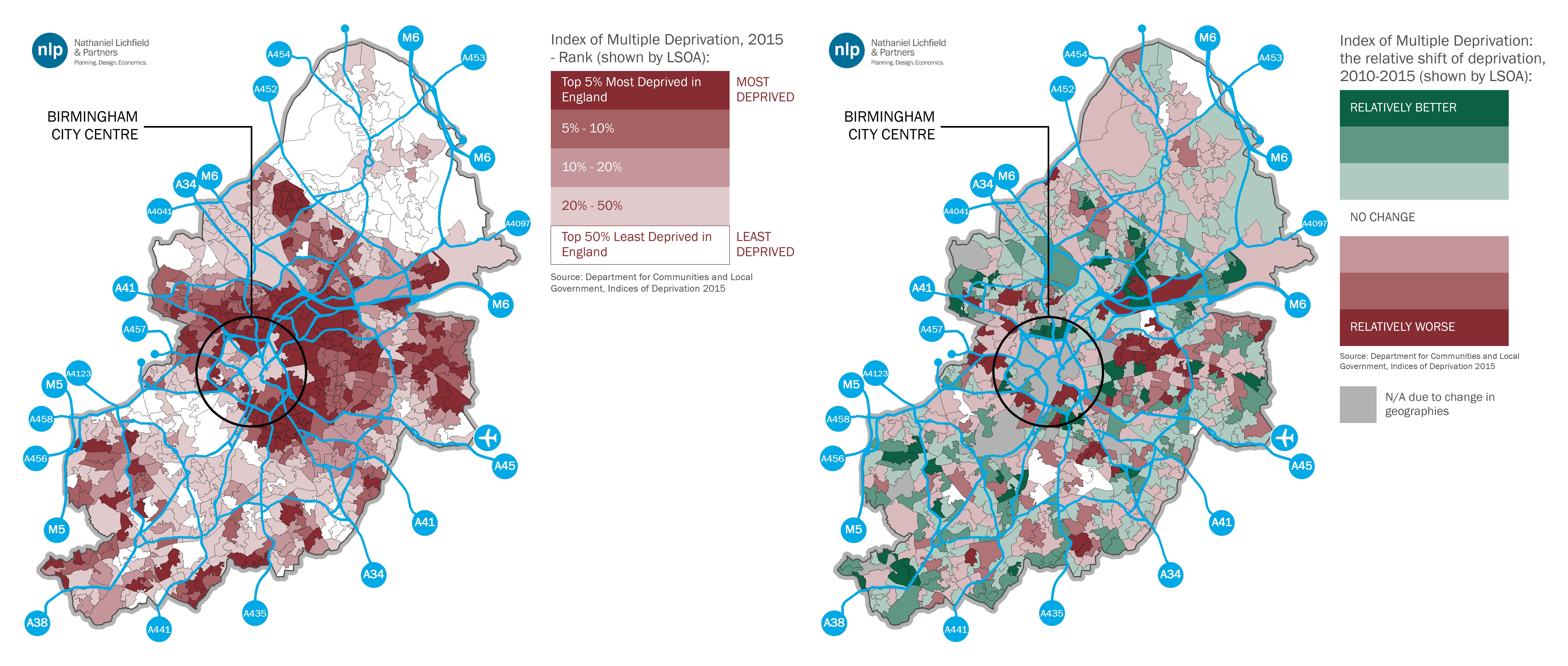
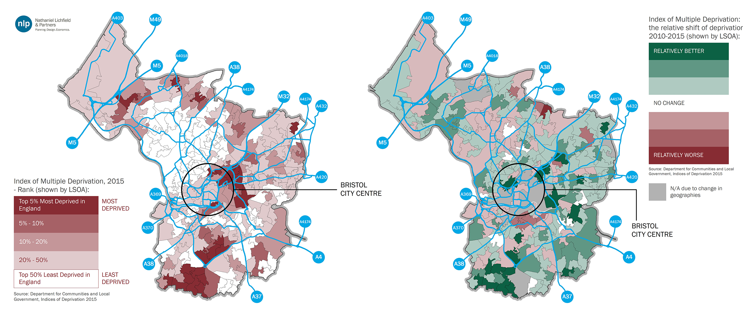
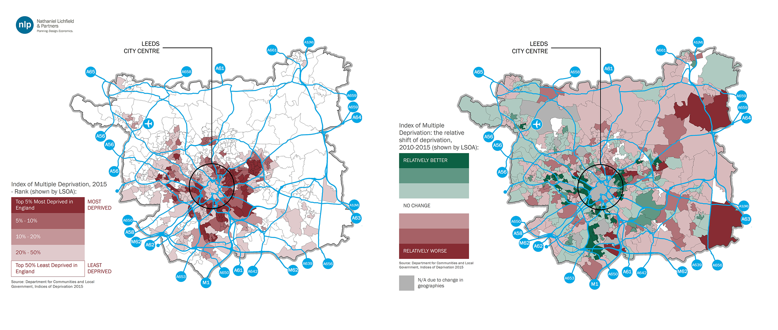
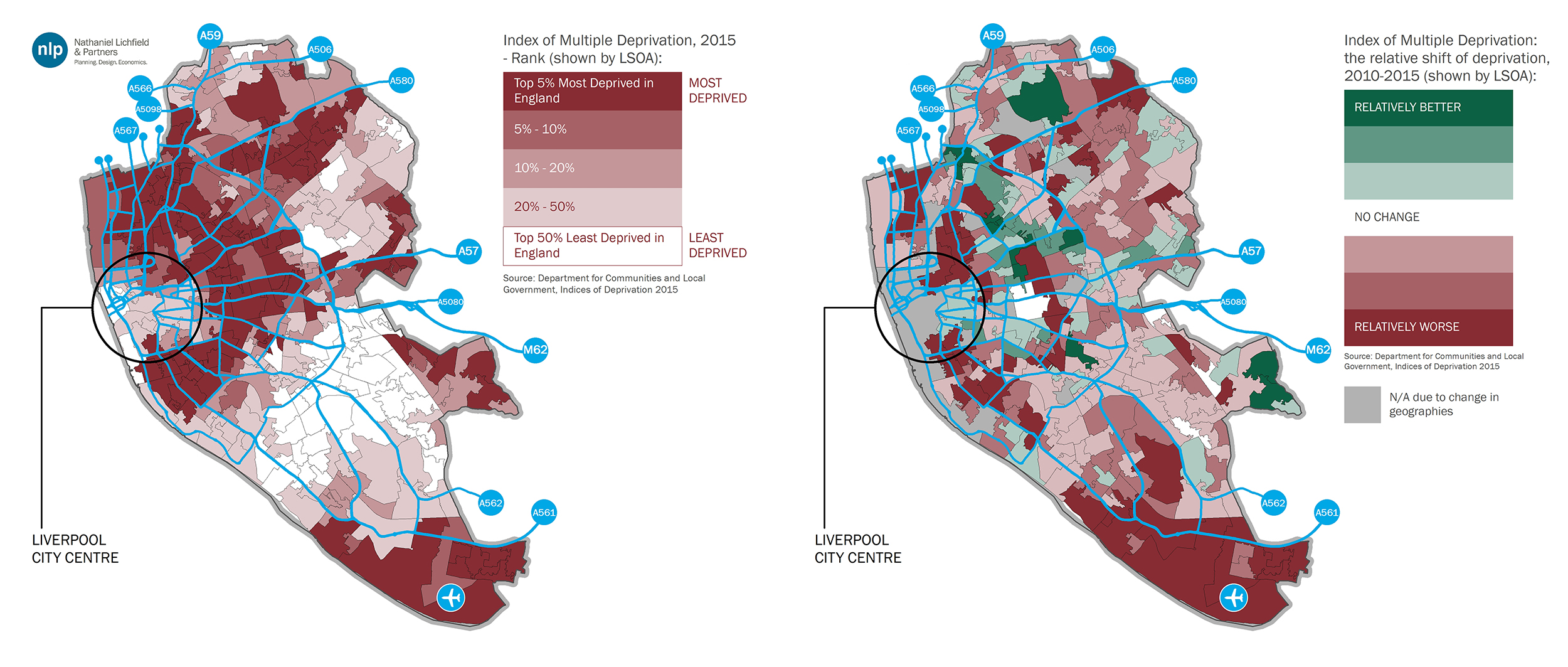
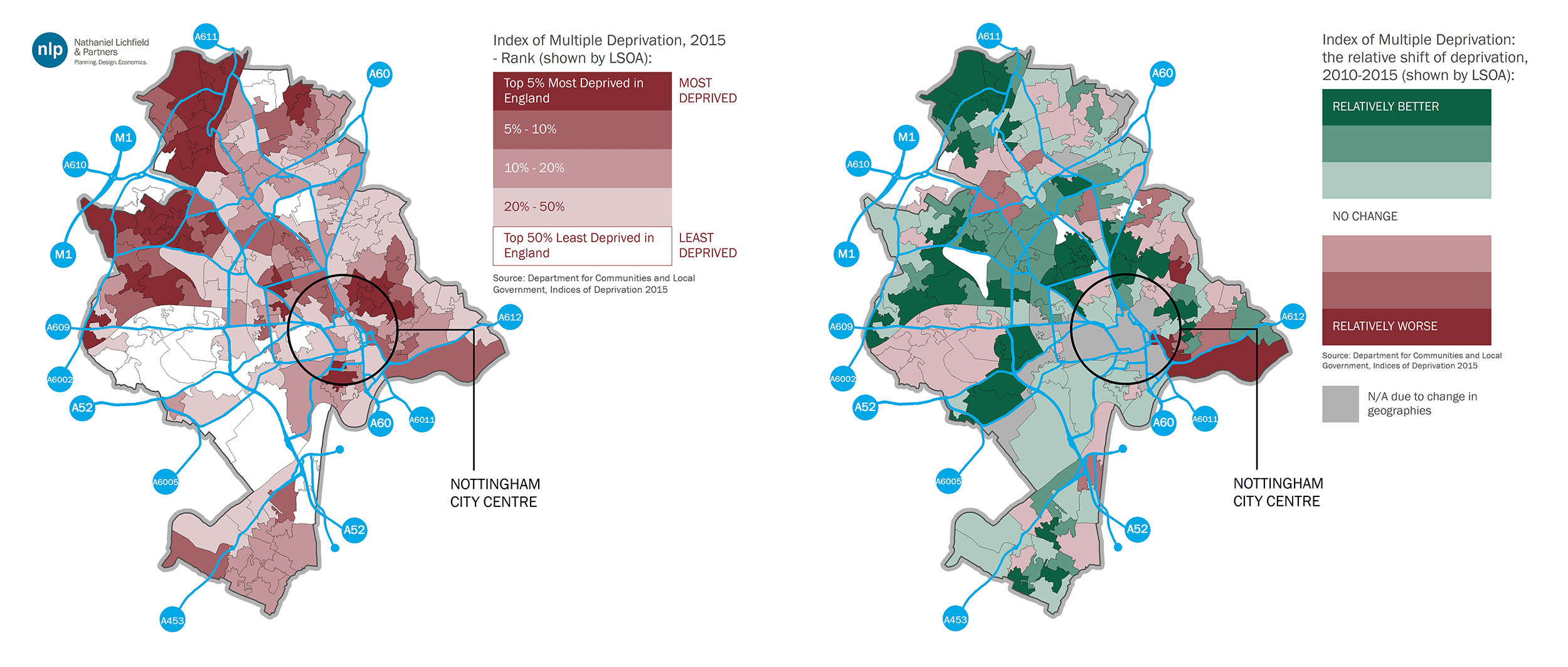
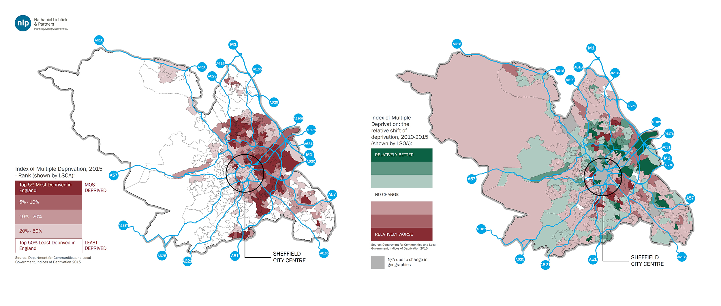
In spatial terms
[1],
higher levels of deprivation immediately surrounding city centres are a common trend across Core Cities (see the maps on the right in Figures 3 to 10), but no clear spatial pattern in the shift since 2010 emerges from the analysis.
Figure 3: Index of Multiple Deprivation 2015 and LSOAs relative shift in Birmingham (Source: DCLG, NLP analysis)
Figure 4: Index of Multiple Deprivation 2015 and LSOAs relative shift in Bristol (Source: DCLG, NLP analysis)
Figure 5: Index of Multiple Deprivation 2015 and LSOAs relative shift in Leeds (Source: DCLG, NLP analysis)
Figure 6: Index of Multiple Deprivation 2015 and LSOAs relative shift in Liverpool (Source: DCLG, NLP analysis)
Figure 7: Index of Multiple Deprivation 2015 and LSOAs relative shift in Manchester (Source: DCLG, NLP analysis)
Figure 8: Index of Multiple Deprivation 2015 and LSOAs relative shift in Newcastle upon Tyne (Source: DCLG, NLP analysis)
Figure 9: Index of Multiple Deprivation 2015 and LSOAs relative shift in Nottingham (Source: DCLG, NLP analysis)
Figure 10: Index of Multiple Deprivation 2015 and LSOAs relative shift in Sheffield (Source: DCLG, NLP analysis)
While it is a useful geographical tool, it would be unwise to use the IMD to assess the actual improvement or deterioration in life standards at individual or household level. Think of the complexity in this way: on the one hand, a negative shift does not imply that an area has not improved its deprivation score, but it could be that it has done so at a slower pace than the English average. On the other hand, there is no indication that an area is becoming less deprived because people are actually better off than they were. It may be because the poorest households are being pushed out.
Nonetheless, the Index is one of the many tools (like the recently updated
Travel to Work Areas) that can help us explore the social and economic dynamics of cities, mindful that devolving or centralising decision-making brings no progress if our knowledge and understanding of the places we want to improve does not improve as well.
[1] For clarity and consistency, the analysis has focused solely on each Core City’s main local authority and not on the surrounding authorities that are part of the same urban area.